Alex's Illustrator Workshop
- Thomas Hughes
- Sep 27, 2022
- 4 min read

Updated: Nov 23, 2022
To start the year off, Alex wanted to share with us any helpful tips and tricks that he wished he'd know whilst starting in Industry. The first session was about how to efficiently use Adobe Illustrator and its many shortcuts.
The basics were also covered, such as the definitions of Leading (Space between lines of type), Kerning (Space between individual characters) and tracking (Space between individual words). The shortcuts to change each respectively are 'Alt' then up, down, left and right on the arrow keys then highlighting the paragraph depending on what you'd like to change. This wasn't new information to me but a very helpful reminder that should speed up my work in Adobe Illustrator or even Adobe InDesign. Figure 1 shows where I played around with a paragraph but also the shape builder tool.
By pressing 'Ctrl y', I can get the outline and barebone structure of each shape, making it easier to see how each layer overlaps. Then by pressing 'Shift, m' this after highlighting the shapes I want to build I can merge together or stamp out overlapping items. This is shown in the red circle with other circles cut out of it by holding down 'alt' and clicking to stamp it out.

Figure 1
The next bit of the workshop focused on typography and how to edit text. To replicate the 'Futuristic Fonts' type in the top left of Figure 2, I had to find a base type that looked similar. I then went to 'Object' which drops down to 'Expand Appearance' making the text editable with the direct selection tool. Using the shape builder tool like in figure 1, I used block and shapes to cut bits off the type to make it look like the font it was after. This process was repeated with the 'Knife' text to make it look like it had been formed by blades cutting into each letter.
Taking the shape builder tool further, we were shown how to mask layers which I previously didn't know was possible in Adobe Illustrator. By layering an object or group over a simple shape and pressing Ctrl 7 to mask or Ctrl Alt 7 to unmask, you can get the effects shown in the bottom third of Figure 2. I experiment by using the sea-scape with simple two letter phrases and lastly re-creating the striped 'B'.


Figure 2
To finish off in Alex's session, we were assigned a task to use many of the new skills. The idea was to simply create a vegetable inspired by the same design style as used in the 'Fresh Food Revolution' graphic as seen in Figure 4. I decided to create a carrot (Figure 3). No real reason why a carrot, other than I don't mind the taste of them. I started by creating the carrot shape with many shallow ellipses merged together using the shape builder. To get the carrot shape, I went to 'Effect' then 'Distort and Transform', This allowed me to create a point at the lower end whilst keeping each ellipse together. The eyes were created by layer 3 circles on top of each other, then stamping out a high cheek-bone with a larger circle below the eye. A simple shadow was added to the left side of the carrot to add a sense of depth through lighting.


Figure 3 Figure 4

Ivan Navarro
Whilst researching for design inspiration, Ivan Navarro caught my attention with his outside the box neon artwork. In particular, the way a two dimensional space is reflected in a mirror to become infinitely three dimensional. This is a concept I thought would be great to experiment with in Adobe Illustrator as I wanted to something unique to put on vinyl record album cover.

Figure 5, a piece called 'Bomb' particularly took my interest with its simple shapes arranged in clear layers but with an awesome depth and perspective.
In Figure 6 I started my design by using bold colours and an unstructured shape that I layered with different colours and opacity. This base was then masked in the corner as I wanted it to be squared off. In Figure 7 was where Navarro's design really inspired me as I grouped lines together, fanning out from the corner. By going to 'effect', 'path' then 'offset path' I found that a neon effect could be created; however, because I had grouped each line together, an unusual
Figure 5 - Navarro, I.N. (2016), Bomb effect was created with what I though was a very
cool sense of depth and perspective much like
Navarro's work. Layering my first design over the
corner of the 'neon' lines, I put it into a photoshop
mock-up getting the result in Figure 8.

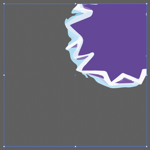

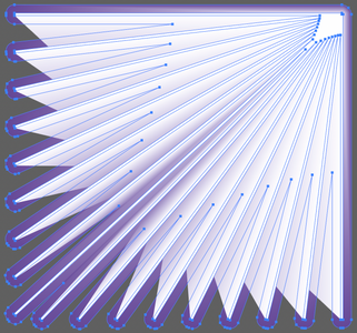
Figure 6 Figure 7

Figure 8

A few weeks later I attended a workshop focusing around a brief for a record cover. Using my skills learnt from Alex's illustrator workshop, I collated a board of images that I could manipulate to create the cover.
The brief stated that we needed to design a cover for a song created by 'Scott Holmes' called 'In Awe':

This task was a great reminder of how to use the mask tool in Illustrator but also using smart objects between Illustrator and Photoshop.


Comments