Alex's InDesign Workshop
- Thomas Hughes
- Oct 18, 2022
- 2 min read

Updated: Nov 1, 2022
Key Notes and terminology from the session
Bleed, Industry standard is 3mm. So you can print of the edge of the page
Orphan - When a word is left on its own below a paragraph
Widow - When a word is pushed onto a new page
Readability

Finding Order
To find order in an InDesign document, there are many ways the page is split up. Margins are used to create a space around the edge of the page. Columns are vertical rulers that space out anything on the page equally. Gutters -despite my knowledge of the gutters being the edge in bowling- are the white space that separate the columns. All these features of creating order can be found under 'Layout' then 'Margin and Columns' or 'Create Guides' and the window shown in Figure 1 pops up.
Figure 1
Type
Colour
Planning
Fonts are the cuts/variants of the typeface
Typeface is the overall name for fonts within the group.
Going through the basics of InDesign
Margins and Columns
Page numbers
Parent pages
Splitting text into columns
Text Wrap - Window/Text Wrap/wrap around object shape whilst clicking on image
To lock layer Command L.
Detect Edges and push text outwards
Splitting Text into columns is a great way to break up a large section of text without having to slave through a large block or read a line that is too long.

Figure 2
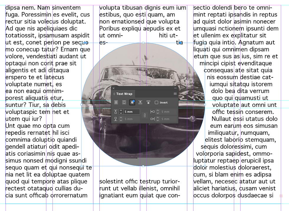
Text Wrapping
A really simple way to compose a block of text near imagery is by wrapping it around the image. To start with, I used a simple circular image, whilst having both the text and image selected, go to window > Text Wrap. The little window shown in figure 4 then pops open to allow you to change the distance between the image and text, but also how the text fits around the image etc. InDesign has a neat feature that recognises the subject in a jpeg and Figure 3
fits the text around that.
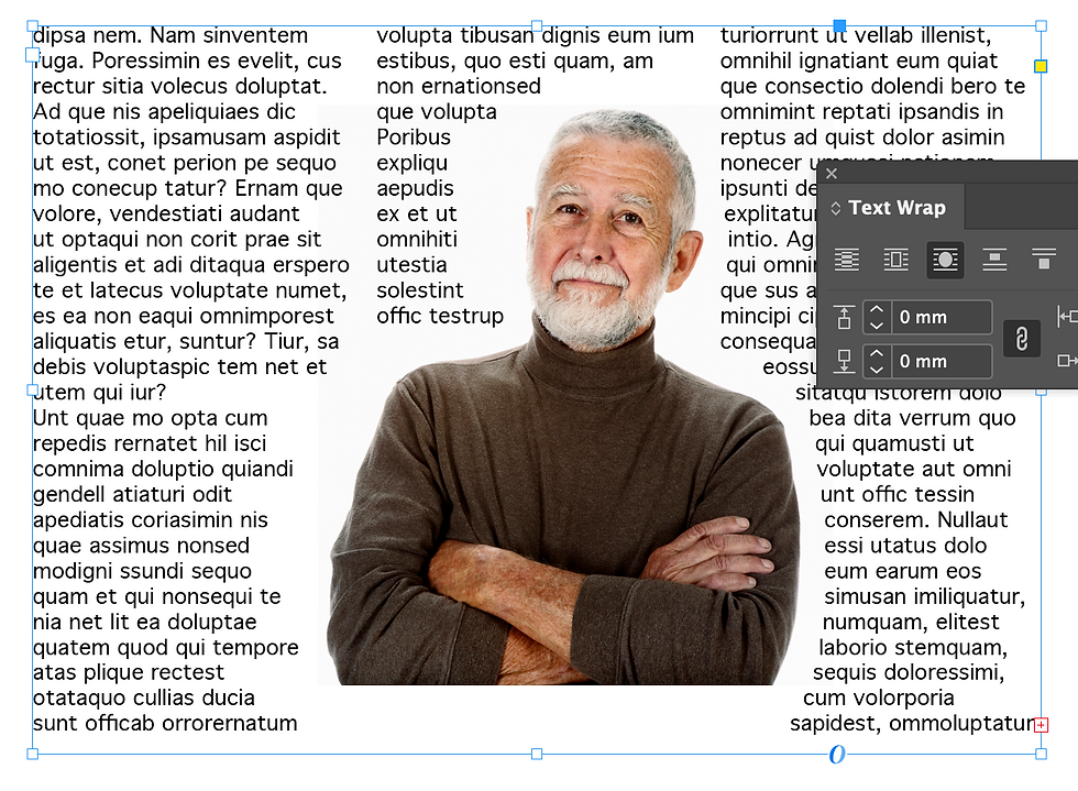
Figure 4

Swiss Style Posters
Using Barbara Hepworth's work as an inspiration, our task was to create an A4 poster to promote a Hepworth sculpture exhibition. The idea was to only use Adobe InDesign as to limit any complexity and keep all designs really simple. This also meant we had to focus on the use and placement of any typography, really looking into the hierarchy.
My idea was to use the iconic, organic, circular shapes in Hepworth's sculptures to add depth to the background whilst only using 2 colours. This meant I could experiment with the text wrap tool by placing the block of text around the central circle. I chose to go with the bold orange and dark blue combination as this was eye-dropped directly from one of Hepworth's works and


A small task using InDesign to structure a small zene based around the idea of 'See Barbara'. I took photos around the Barbara Hepworth building with a common idea of line and reflection to place into the zene. The typography I used, I wanted to keep to a minimum by keeping it small or incorporating it into the imagery such as the front page.


Comments